
Linked Analysis Assistant:
Introduce a no-code environment visually and efficiently to relieve users from scripting
“ As a SAC analytical content developer, how to get an overview of linked analysis from a complex dashboard, and then manage all related charts/tables/filters in an easy and efficient way?“
Background
Linked Analysis is a convenient function for linking charts/tables to control the filtering of one element by another.
Currently, users have to write lines of code to build the links among multiple analytics components, which is not user-friendly and inefficient.
Linked Analysis Assistant is firstly a visual view of all widgets in the analytic application with links connected with each other.
My Role
Prototyping, Product design, Interaction design
Team
One Technical Product Manager, One Product Owner, One Architect, One Developer, Two Designers (for design crits)
Duration
April 2021-July 2021
MY CONTRIBUTIONS
As a UX designer, I took the responsibility for UX design, communication works, and usability validation for the new 'Linked Analysis Assistant' feature. I work closely with the whole team to:
Defined design goals and specified user flows for each of the use cases.
Create end-to-end experience for user needs to hand over hi-fi design mockups.
Developed different variations of wireframes and interactive prototypes for assumption validation.
Deliver rapid iterations based on feedback, trade-offs from end-users, and business perspectives.
OVERVIEW
Goal
Leverage a no-code environment in app design to overview and build links among analytics components in a visual and efficient way.
Use Case and Requirement
As an app developer, I can open a graph view at design time to get an overview graph of all the links among widgets (incl. FilterLine and Input Control linked with charts, tables, etc). And I can also navigate each widget to find its relationships, and manage the relationships.
‘'Linked Analysis Diagram’
The linked analysis diagram shows all the widgets and the links between them
Allows app designers to manage links between widgets in diagrams
Supports links among charts, tables, maps, filter lines, input controls, and R widgets
UNDERSTANDING
Problem
As a SAC analytical content developer, how to get an overview of linked analysis from a complex dashboard, and then manage all related charts/tables/filters in an easy and efficient way?
Pain Points
Currently, for the sake of achieving this, users have to:
Understand the business logic of this Story or Analytic Application via viewing configurations/scripts of each analytics component
Write lines of code to build the links among multiple analytics components (shown below)
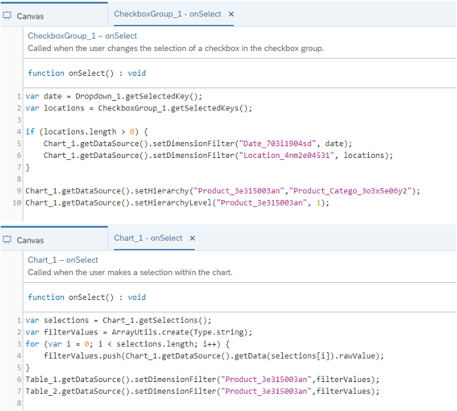
Current method for building the links
FUNCTIONAL DESIGN
‘DIAGRAM WIDGET’
Each widget in the diagram is represented by a node with a widget icon and widget title. For a widget without a title or the title is hidden by the user, widget ID will be used instead. The tooltip of the full text of the widget title and ID will show when the mouse hovers:
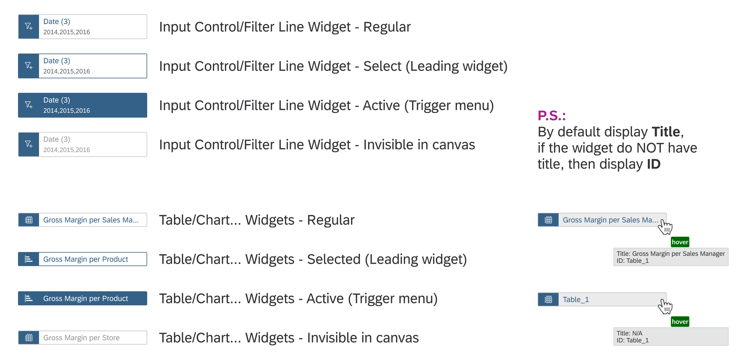
Different status for different types of widgets
The Leading widget is the widget that focused on the canvas to show its source widget and target widget.
Invisible widgets with links will be shown as well, but the text will with grayed-out style. In canvas, it’s able to drag & drop the diagram as a whole and zoom in & out.
VIEW LINKS
Linked Analysis is a convenient function for linking charts/tables to control the filtering of one element by another. The links include:
- Filter Line to Chart / Table (group or individual filter)
- Input Control to Chart / Table / R / Geo / Value Driver Tree (linked analysis)
- Linked analysis among Chart / Table / Geo
- Linked analysis from Chart / Table / Geo to R Visualization
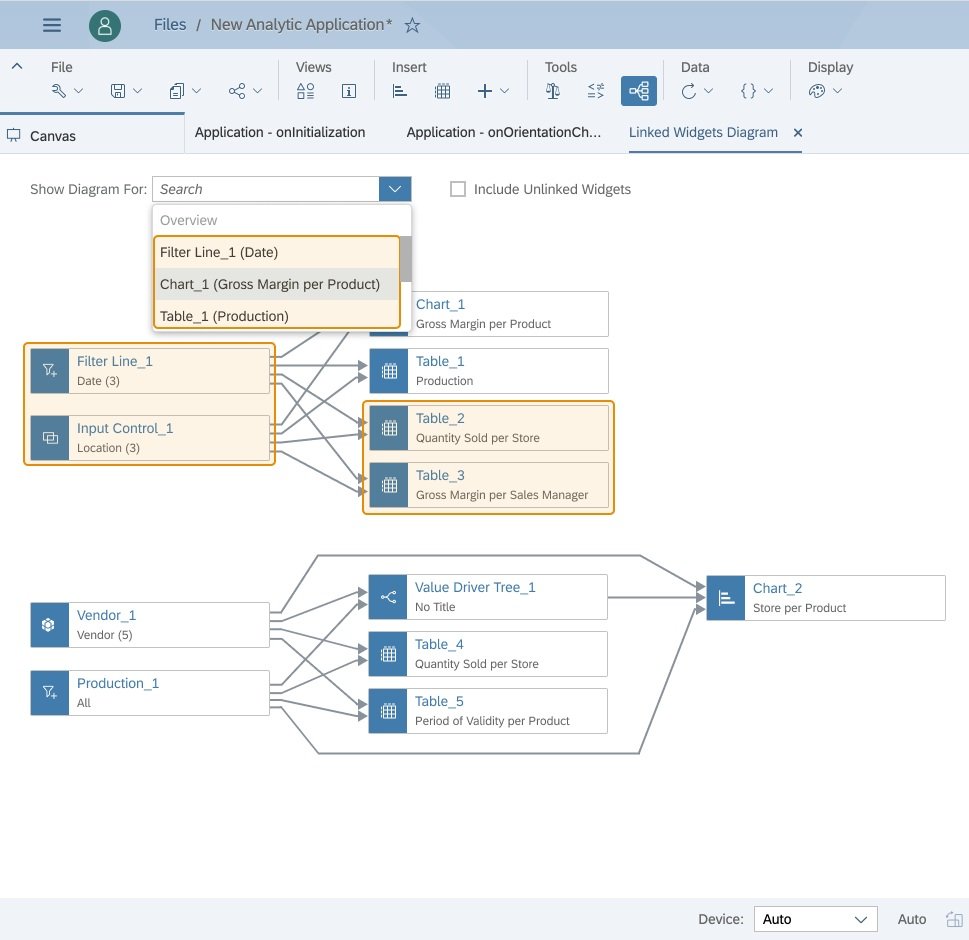
A dropdown menu is used to switch between Overview (which is a linked diagram with all widgets in the application) and the view of each individual widget (which only shows the links related to the leading widget to avoid chaos). Linked Analysis Assistant will be initially opened in Overview mode, then next time in the previous state:
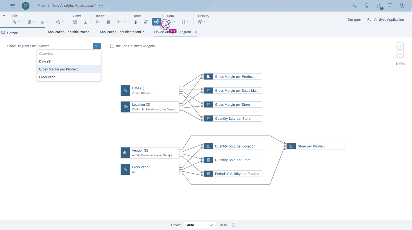
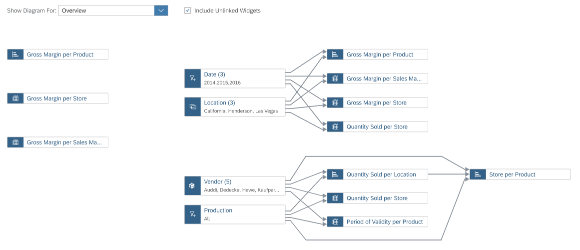
A Sample Default Overview Linked Diagram and the Dropdown Menu
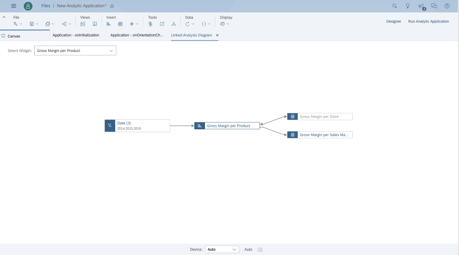
A Sample Linked Diagram for Individual Widget
A checkbox is added next to the dropdown to include unlinked widgets or not (it's by default off in "Overview" mode. The groups of linked and non-linked widgets are put side by side:
Unlinked widgets & Linked widgets in Overview
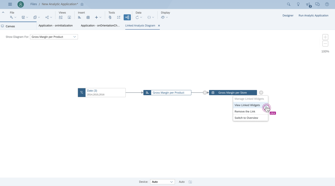
Besides using the dropdown box mentioned above, users are also able to change among Overview diagram and the view of each individual widget via the context menu item:
- "View Linked Widgets" (when in the view of an individual widget, it is only available for non-leading widgets)
- "Switch to Overview" (available for the widgets when in the view of the individual widget)
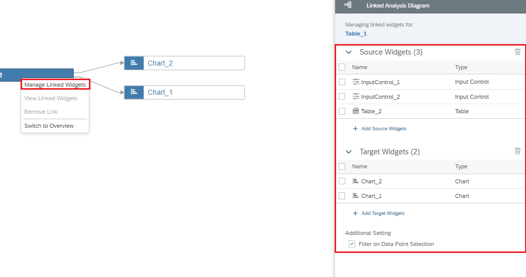
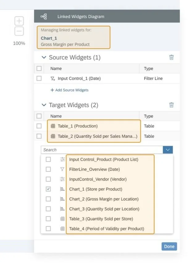
MANAGE LINKS
Be able to edit links of source/target widgets in the side panel, which is triggered by context menu items of:
- ALL widgets in the Overview diagram
- Leading widget in the view of the individual widget (P.S.: Non-leading widgets are not supported)
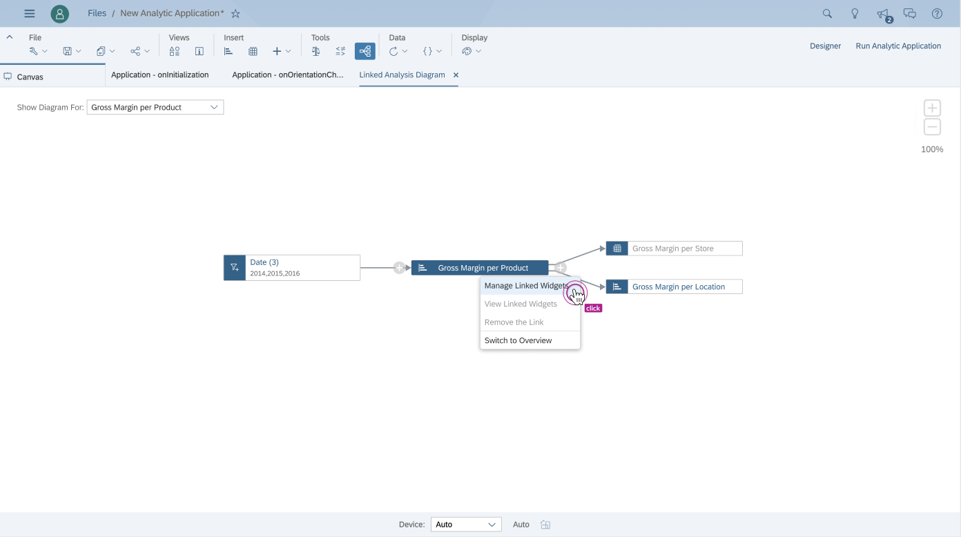
Manage/view/remove/switch capabilities through context menu
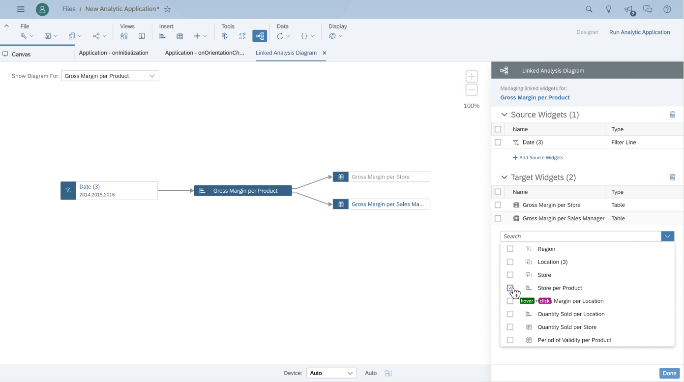
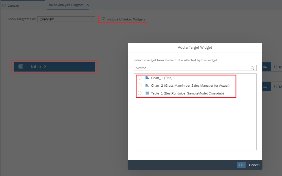
When click on ‘Add Target Widgets‘ - drop-down box shown for selection
EMPTY STATE & EDGE CASE
Considering provide a kind reminder for end-users, we thought about the empty state for no selection and read-only panel for those non-leading widgets in the view of individual widget.
Empty State
Read-only panel for edge case
USER STORY
I took a simple end-to-end user scenario case here to show how users might act to achieve their goal in a real system environment for further deep dive:
SETTINGS
As it shows, access to the settings is carried out through the additional widget (‘. . .‘) menu:
Then we define the scenario and which components we will filter:
By default, both single selection and multi selection are possible:
LINKED ANALYSIS DIAGRAM
The new linked analysis diagram allows application designers to get a visual overview of all the links among widgets and they can also modify the existing relationships for each widget directly here.
There are two ways to switch to this mode:
via the top menu
via widget
TOP MENU
when you click the link to analyze diagrams, an additional tab will open:
a visual-graphic bundle of customized widgets appears with the ability to add new unlinked widgets with the ‘+‘ icon(hovered effect):
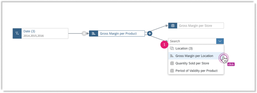
when we select an inlink widget, we have a component outside the bundle and when we click on +, a pop-up opens with a choice of widgets for linking:
through the context menu, you can enable a menu with link management:
this tab (linked analysis diagram) can be left open and at any time you can go to it with switching between the main canvas:
WIDGET DIAGRAM
you can go to the same tab through the widget and this diagram will open in the context of the selected widget:
option to display a diagram when connected to a link analysis input controls (give you the ability to change which dimensions or measures to display for your charts or tables.):
USERZOOM STUDY & POC VALIDATION
USERZOOM STUDY
For the sake of design concept validation, we conducted several usability testings through UserZoom. Here is our working file for this virtual moderated testing session - User Study – Moderated UserZoom Session
Moderated UserZoom Study
UX Writer + UX Designers
POC VALIDATION
Aiming for a user-friendly and easy-to-use ux for customers, we conducted POC validation for a better experience. Here are some focused questions for user validation in the working file - Linked Analysis Diagram_POC Validation
And a glance at statistical graphs and testing feedback from test participants:
Screenshot of Key Testing Results
Screenshot of Testers’ Comments
After the discussion with the product owner and developer, we scoped the feasible room for improvements according to the testing results for bringing in better UX to target users. While considering the timing, resource, and technical boundaries, some aspects are left as backlogs and waiting for the next phase’s enhancement.
ITERATIONS DESIGN
FOCUSED AREA
Cloud resource management and control scenarios give priority to efficiency, which determines that we pay more attention to generality and standardization in design. But from a UX perspective, we were also exploring how to optimize usability without compromising operational efficiency.
A cloud resource has several attributes, such as name(title) and ID. In general, resource IDs were used as unique identifiers. They have the advantage of being unique and never default, but the automatically generated machine code IDs are weaker than the artificially named resource names(titles) in terms of legibility and identification. So we improved info display in this iteration.
In addition, considering the feedback from customer validation sessions, we iterated for focused improvement areas:
Renaming of the diagram from “Linked Analysis Diagram” to “Linked Widgets Diagram” (because we enhance tech capability to support cascading relationships)
Ability to visualize and edit the cascading relationship between input controls in the Linked Widgets Diagram
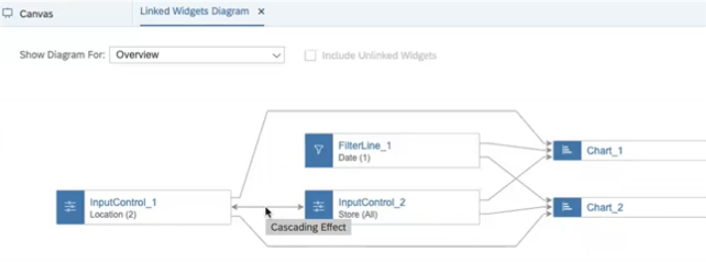
Showing cascading effect (tooltip as a hover effect) between Input Controls
Improve information display in Linked Widgets Diagram
Add filter dimension name of input control & filter line in the dropdown box at the top.
Add the title of the widget in the diagram. Show "No Title" if the title isn't set by the user.
Adjust the tooltip of the widget in the diagram to show ID first, and Title in the second row as supplementation.
Show title of widget and filter dimension name of input control & filter line in side panel title.
Add the title of the widget and filter dimension name of input control & filter line in the "Source/Target Widgets", and "Add Source/Target Widgets" list in the side panel.
In addition, for the sake of easier handover from design to the dev team, here are some samples for multi modes and interactions for clearer explanation (updated from iteration):
Updated multimodes and interactions spec
TARGET VISION FOR FUTURE SCOPE
These target designs are iterated based on the feedback from our customer validation sessions. While unfortunately considering the timing, resource, and technical boundaries, these aspects are left as backlogs and waiting for the next phase’s enhancement.
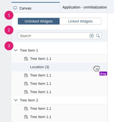
Tabs for switching; Search bar; Stack tree for drag&drop
A tree structure is visualized like an ‘outline’ in the top-left dropdown list box, offering a clear structure consisting of different levels
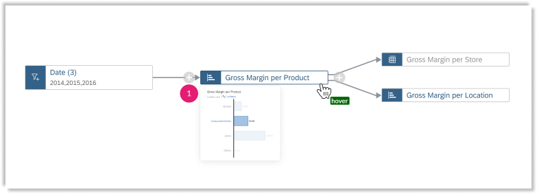
A visualization of the widget preview will show when long hovering on the certain diagram.
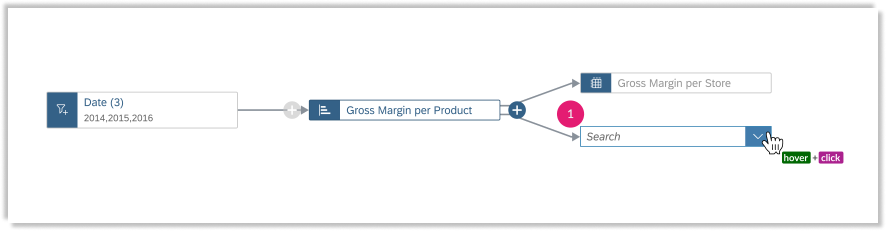
Add singular source or target widget through ‘+’ add icon besides the widget, a new connector for in-place editing shown directly.
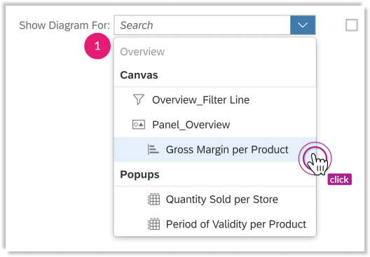
User could search or select from dropdown list box shown easily
DESIGN SPEC & DOCUMENTATION
Sneak peek into design documentation (this feature has released in 2021 Q4):
DESIGN SIGN OFF & KEY LEARNING
Ask questions and learn from everyone
SaaS system is complex and daunting, especially in use cases for both app designers and developers. I spent a lot of time talking with the product owner, architect, and developers, asking "silly questions" to understand the purposes, functionalities, and limitations of the devices. By frequently raising questions, I not only learned every part of the system but also formed a reciprocal and supportive relationship with them, which was beneficial in cross-functional collaboration.
Design with limitations
The biggest lesson I learned from this project is to understand and get used to limitations. Just like painting, an important thing is to understand the tools at hand, the canvas, and the materials. Likewise, we should understand the system, the backend operational logic, and the data so that we won't subject our design to the whim of our naive minds.
Work with ambiguity but always look for chances to check the assumptions
I made many assumptions during the ideation and design process. I kept a list of questions I had and looked for opportunities to get them answered by consulting and formal and informal usability studies.
Home / DATA INSIGHTS ENABLER / USABILITY TESTING / LINKED ANALYSIS ASSISTANT / YIRENTAL / SKILL PAL / ORGANICOO / FOBO / SEEK / PLAY / ME