
Data Insights Enabler:
To make data alert smarter for customers.
“ As an application consumer, I can list and filter (search) all my data change insights crossing different applications together, and the insights are ranked by their importance cross applications."
Background
With Data Change Insights, you, as an analytic application user, can subscribe to a chart’s top N data change insights of an application on a daily, weekly, or monthly basis to intelligently auto-discover significant data changes of your dashboard application within a particular period.
Currently, users have to go through different emails to see all data changes across applications, which is inefficient and not user-friendly.
My Role
Product Scoping, Prototyping, Product design, Interaction design
Team
One Product Owner, One Architect, One Developer, Two Designers (for design crits)
Duration
Sept 2021-Nov 2021
MY CONTRIBUTIONS
As a UX designer, I took the responsibility to discover user needs, scope phases, end-to-end UX design works, validate concepts, and do usability testing for this new ‘data change insights' feature. I work closely with the whole team to:
Involve in development planning, prioritization and ideation, and execution of new UX ideas
Work collaboratively with UX and UA colleagues, product owners, architects, and developers to create UX documents of user flows, specs, and high fidelity mockups by using the prescribed design system
Assist scoping release phases by user needs and priority, validate design proposals through usability testing with end-suers
Participated in and ideated for an innovation contest with a cross-LoB functional team
PRODUCT DESIGN GOALS
Currently, application consumer is receiving individual Data Change Insights email for every Analytic Application. We need to provide a central place to enable application consumers to see all data changes at once rather than go through different emails.
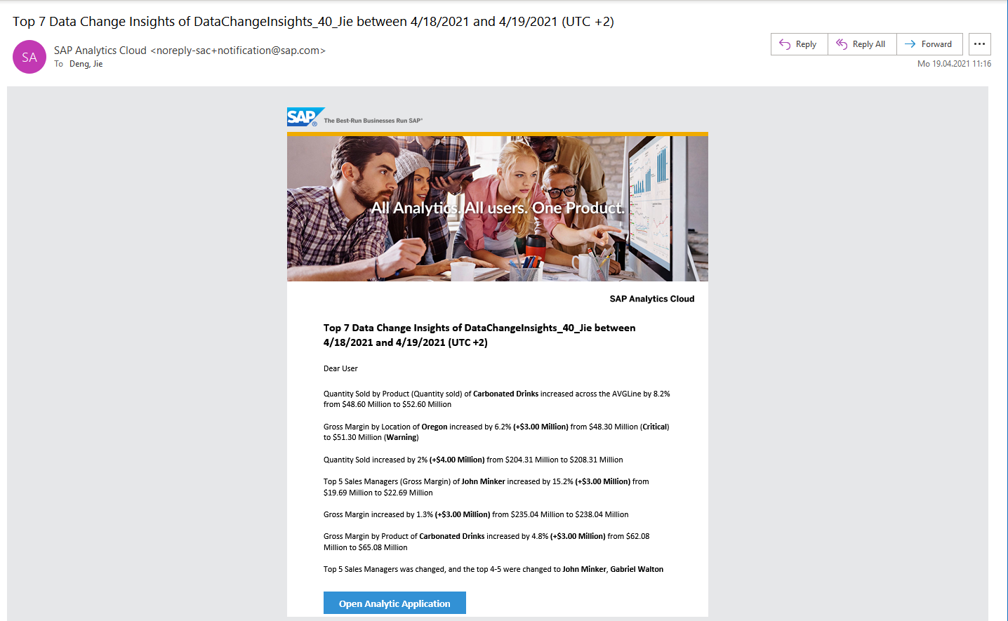
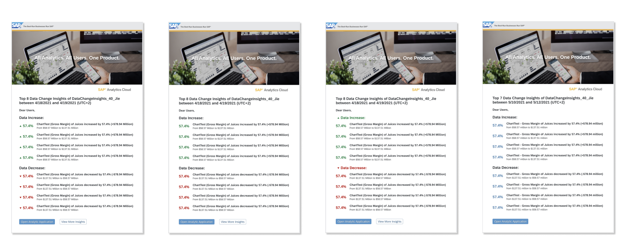
Original Notification Email
App consumers are receiving plenty of emails for data change monitoring, which is really annoying and inefficient for them.
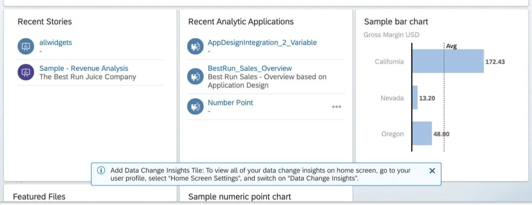
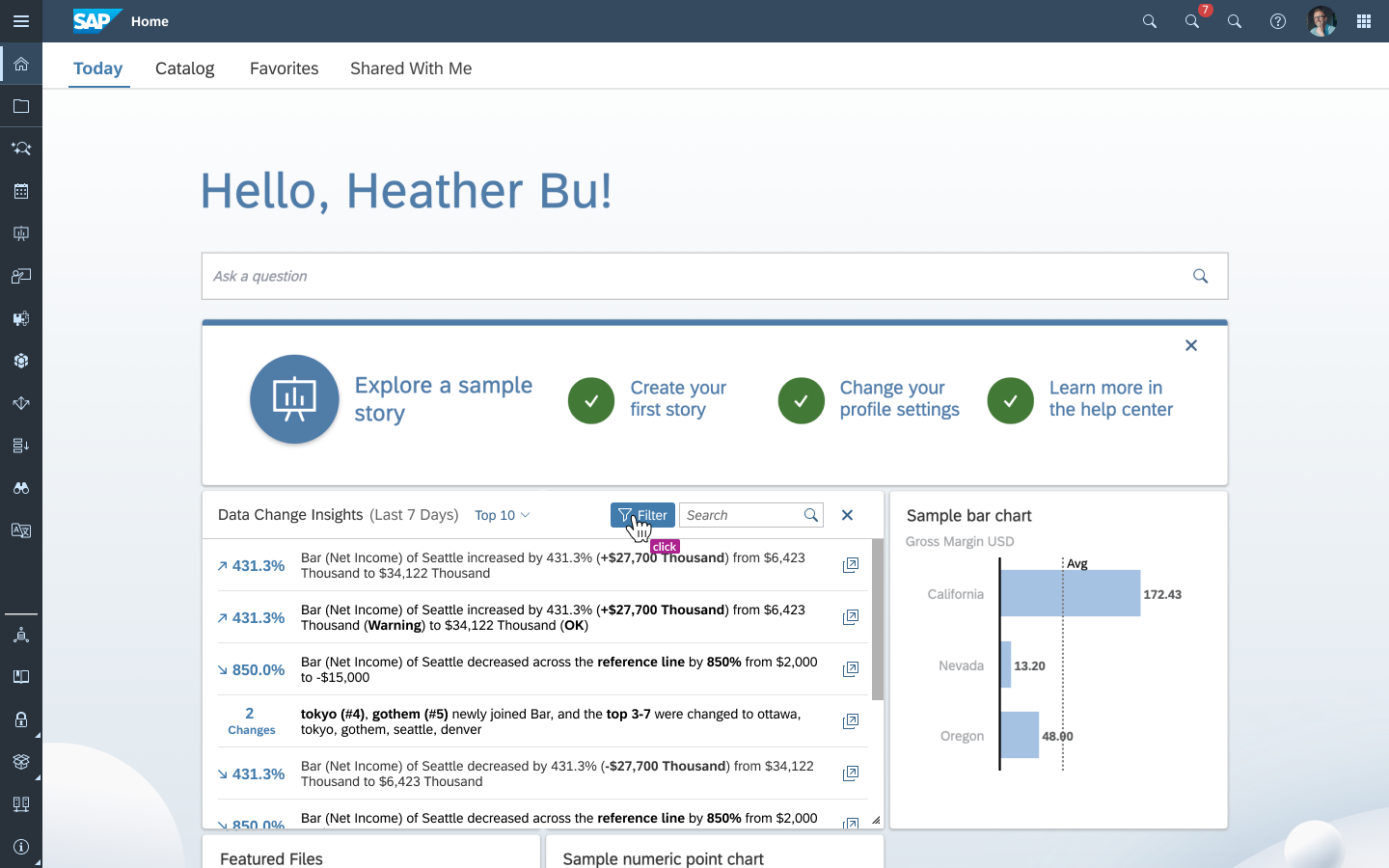
As one of the business goals, users are able to add Data Change Insights as a tile, front and center on the SAP Analytics Cloud home screen to include:
Subscribed data changes across applications
Ability to search a certain data change
Ability to filter data changes with different criteria (top N, time range, and importance)
UNDERSTANDING
Requirement
For customers’ benefit, conveniently filter and search important Data Change Insights across different analytic applications through centralized access to data change insights as a tile on SAP Analytics Cloud home screen.
Use Case
As an application consumer, I can list and filter (search) all my data change insights crossing different applications together, and the insights are ranked by their importance across applications.
How might we provide benefit for customer to centralized access all data changes crossing different applications and scape from dozens of emails?
RESEARCH & DESIGN LOGIC
Research
Through as-is audit and inspirational investigation, we consolidated our insights to identify design strategies for consistency and usability experiences. For information display, we followed the principle of:
(relatively) High density
Fast access
Easy positioning
For instance, by optimizing spacing and alignment between elements, columns, and partitions, the eye moves as straight as possible to scan data faster - Provides rules for default alignment and ellipsis for different data types.
Moreover, "Browse" and "Switch" are the two most frequent behaviors of users. In the case that users need to switch between different objects frequently, we fixed the switch area at the top of the page, so that users can always see the switchable items when scrolling, which not only maintains a clear sense of positioning but also can easily switch and locate during browsing.
Fast Access Information
Easy Positioning Switching
Design Logic
Considering the user experience of the business intelligence analysis platform is characterized by "a large amount of data and multiple dimensions", "a certain threshold of business logic understanding" and "diverse user types/perspectives". Based on this, we optimized the ease-of-use design from the following three aspects:
Easy operation: enhanced predictability, efficient operation - key information front-loading (like notified dates/app names/variance/KPIs) and collapse associated content
Clarity: Information hierarchy, light and efficient
Easy to learn and easy to understand: efficient and easy to read, aid in judgment
Enhanced predictability and information hierarchy
Assist anticipation and collapse associated dates
Ensure readability and expand direct subordinate
FUNCTION DESIGN
New Tile in Home Screen
Add a new card –- "Data Change Insights" in home screen of SAC. And the card can be configured via "Home Screen Settings" (default off).
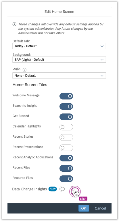
Dialog for Setting Home Screen Tiles
The content of the card can basically include:
2 display modes (hovered effect)
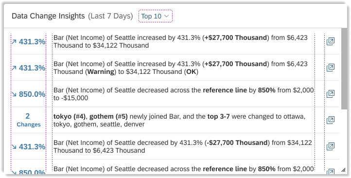
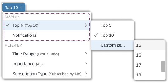
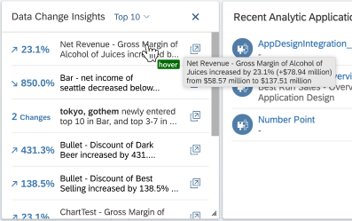
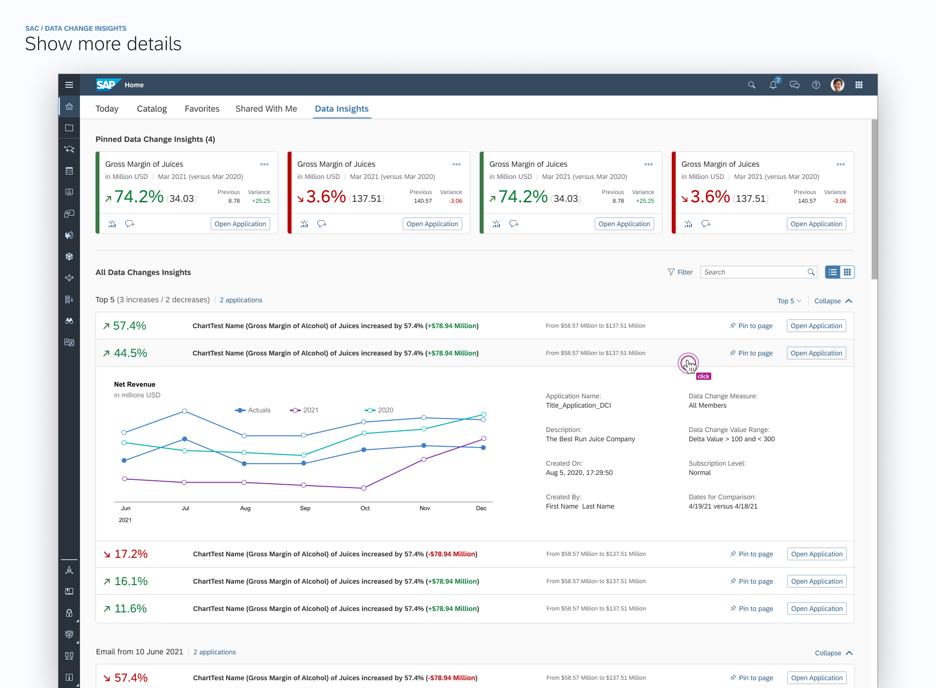
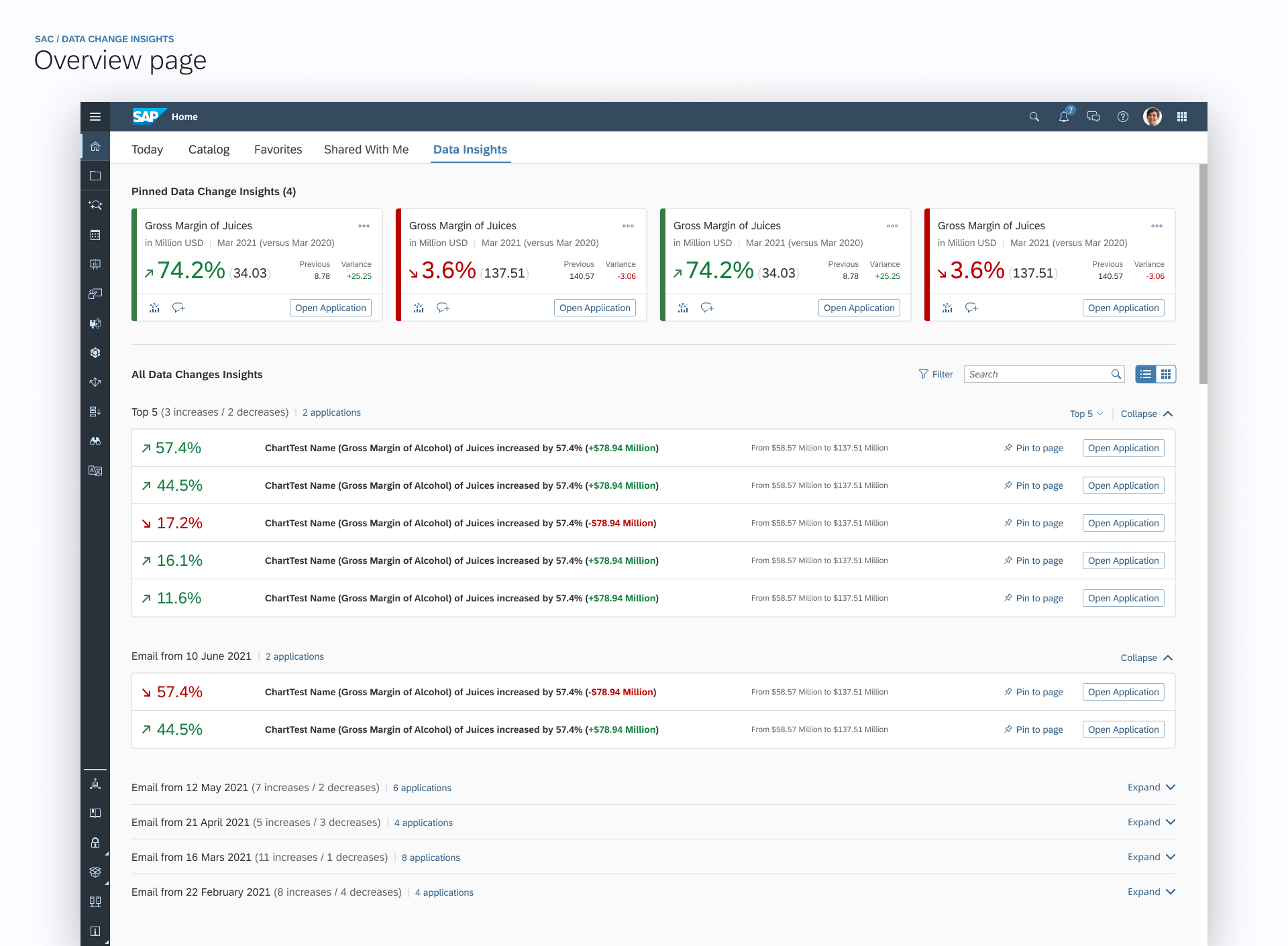
Top N data changes insights across different applications ranked by their importance. N = 5, 10 (default), customize (users are able to select a number from 1 to 20);
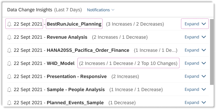
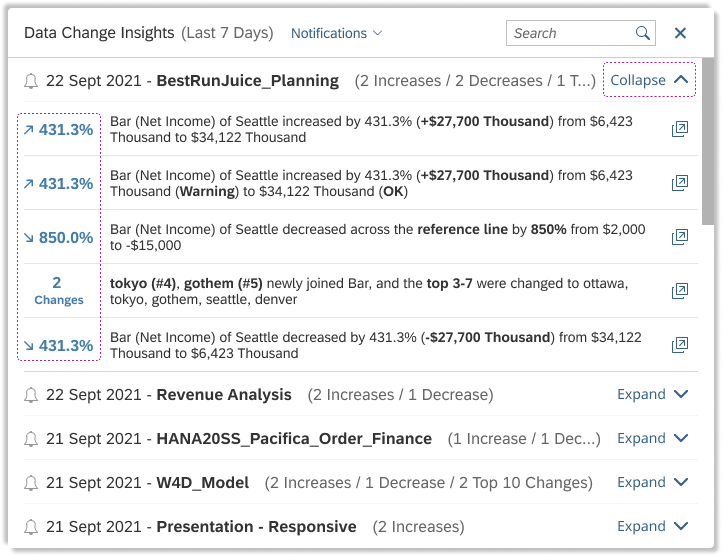
Data changes insights by Notifications/date: The insights are grouped by date, displayed in increase, decrease, top N, and ranked by importance. The group title includes the date, application name, and the number of increase/decrease/top N. Each group can expand and collapse;
By Top N
By Notification/date - Collapsed
By Notification/date - Expand the 1st row
Based on the end-users’ card sorting results and consolidation of all feedback and discussion with internal stakeholders. Each insight is displayed in a row including measure name, dimension value, original value, current value, the delta value, and chart title. The sentence will be auto-wrapped or truncated per various widths. If it is truncated, the full text will show when the mouse hovering. And users are able to open the related application by clicking the icon placed at the end of the row;
By enumerating all formats of the data change insights, we categorized Four types of display for data changes from all insights formats:
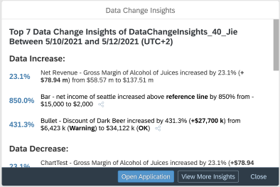
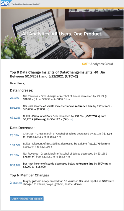
Value Change: ChartTest - Gross Margin of Alcohol increased by 23.1% (+$78.94 m) from $58.57 m to $137.51 m
Over Reference Line: ChartTest - Net Income of Seattle decreased below reference line by 850% from $2,000 to -$15,000
Over Threshold: ChartTest - Discount of Dark Beer increased by 431.3% (+$27,700 k) from $6,423 k (Warning) to $34,122 k (OK)
TopN Member Change: Tokyo, Gotham newly entered the top 10 in ChartTest, and the top 3-7 in Net Income were Ottawa, Tokyo, Gotham, Seattle, DenverFor value change over the threshold, the name of the threshold range will be shown;
For top N member change, the string is different and the changed members will be mentioned in the insight;
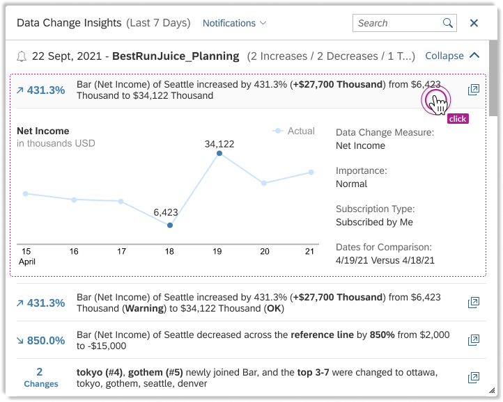
When clicking the insights, will show more information including
Line chart to show value changes over time. For top N member change, the chart will be a Column to list the later topN members;
Data change measure, value range, subscription type, subscription level, and comparison dates;
Dropdown to switch 2 display modes, and insights filters. Default is Top 10, Last 7 Days, All subscriptions, Subscribed by Me;
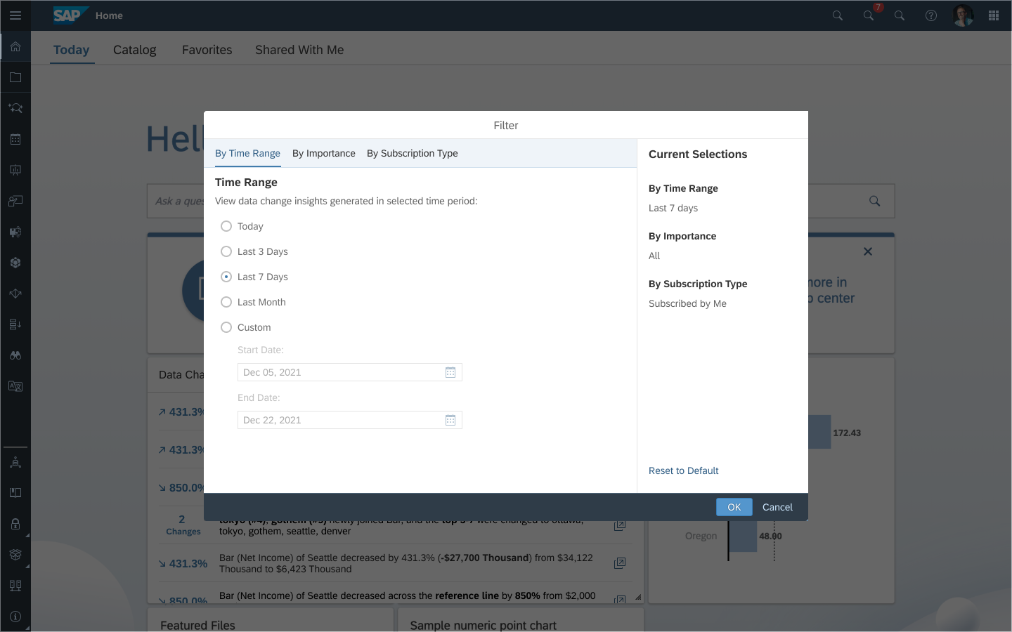
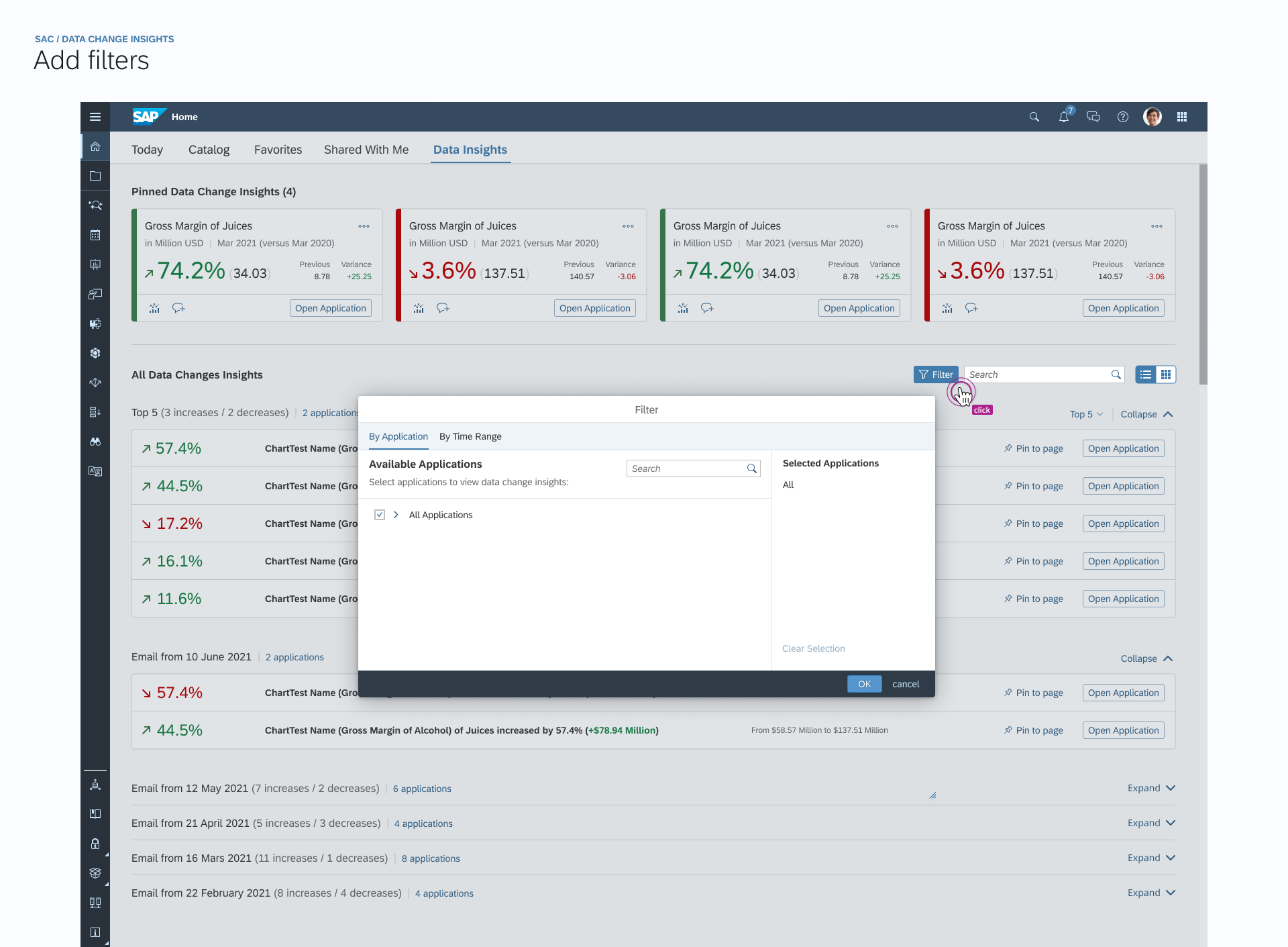
Filter the insights by
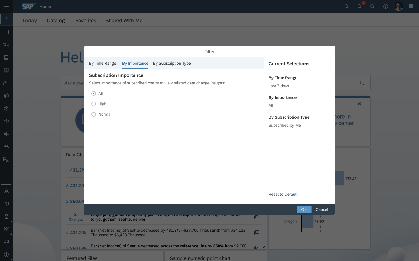
Time range: Be able to set the start & end date to specify the time range of generating insights. The possible time ranges are Today, Last 3 Days, Last 7 Days, and Customize. It's by default "Last 7 Days";
Subscription level: All / Normal / High;
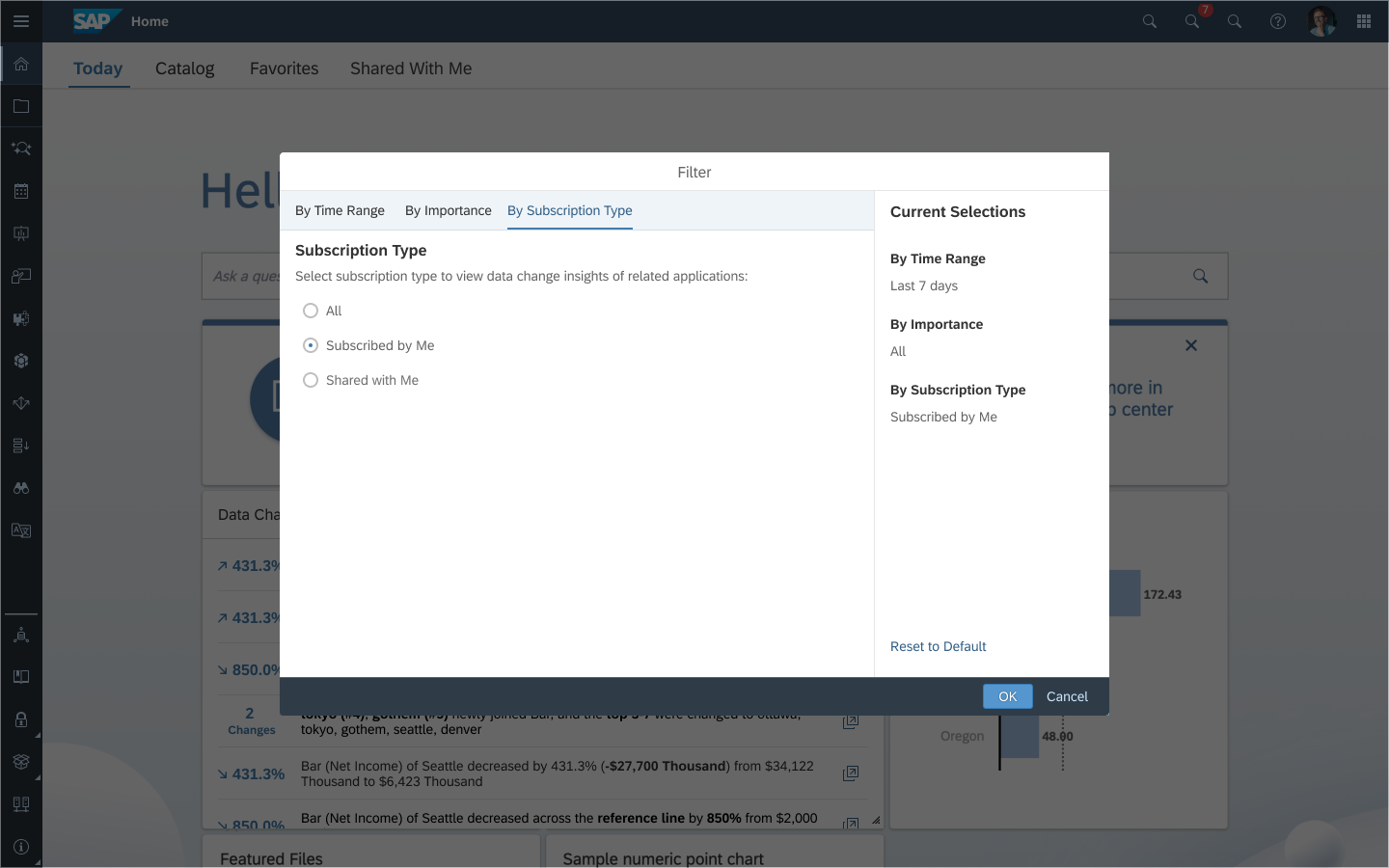
Subscription type: All / Subscribed by Me / Shared with Me
Search box to search keywords of existing listed insights' content (client-side search)
The card title will update according to the time range filter
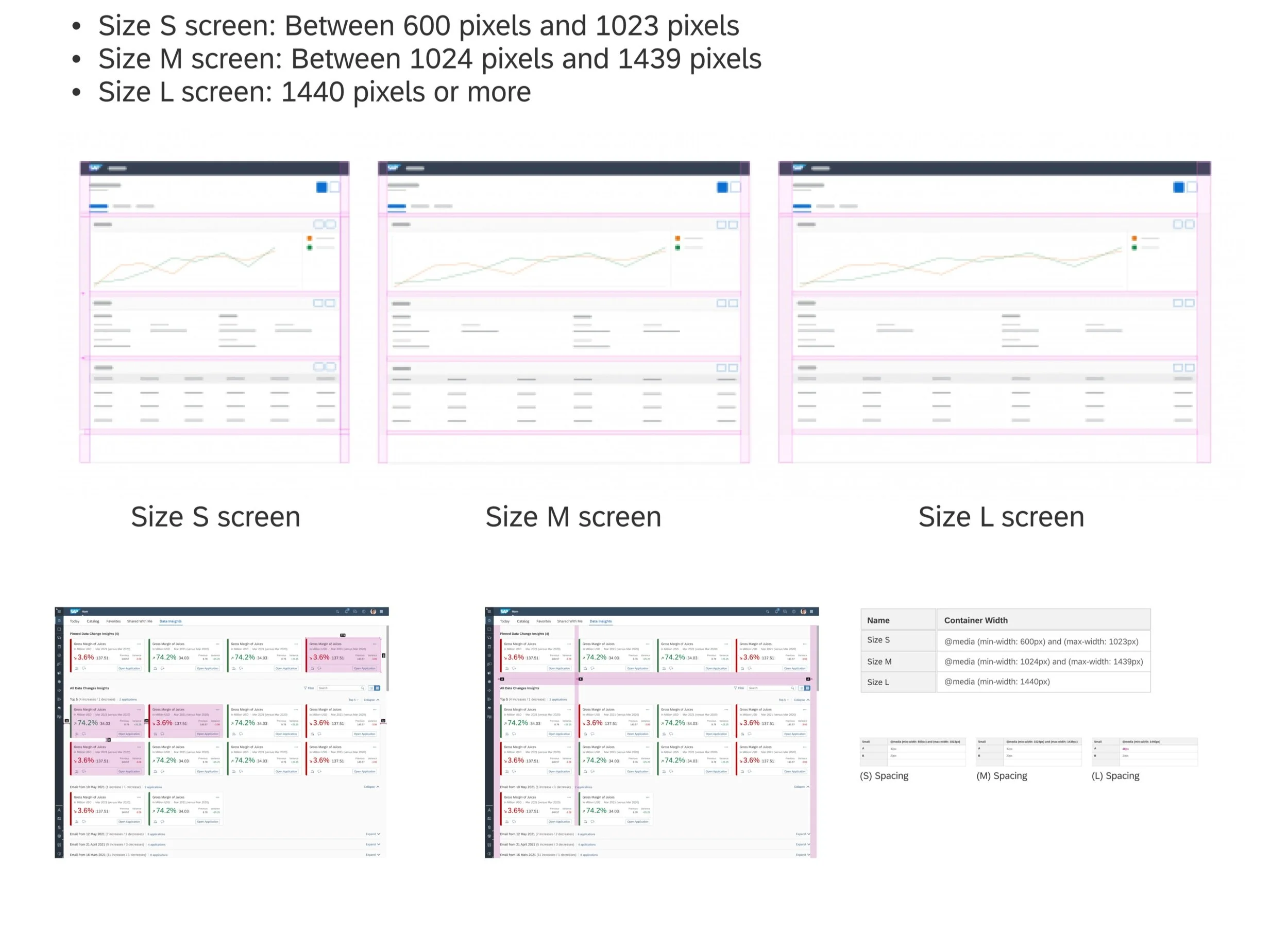
In addition, for the sake of catering to different screen sizes and user preferences on the home screen from real user cases, the card is resizable. And the content of the card is various by 3 different card sizes after resizing.
2x1 (default):
Size of 2x1 (default mode)
3x1:
Size of 3x1
1x1: Different from 2x1 and 3x1, 1x1 doesn't have the search box. And the insights are not able to expand to show more information, i.e. chart, value range. And the card title is fixed to be "Data Change Insights", not showing a ‘real time‘ filtering range. Considering a small space in a 1x1 tile, we enable the hovering effect to show the full text.
Size of 1x1
Notification Panel & Email Template
Add a button ‘View More Insights‘ in the Data Change Insights message in the Notification Panel/popup. When clicking it, it jumps to the card of Data Change Insights on the home screen. If the data change insights card is disabled on the home screen, a floating warning message to inform the customer to switch it on.
An in-app user flow for guiding to home screen central place
Friendly floating message for kind reminder
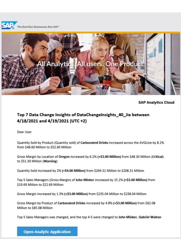
In addition, I made some changes to improve the UI and Enhance the capability of the Data Change Insight email template. Including:
- Change the image in the banner to avoid busy representation
- Restructure the types of insights for both content and style
- Highlight data variance and adjust the line spacing to improve readability
- Differentiate the insights owned by users or shared by others through share icon
As-is
Proposed Design
USABILITY TESTING
Teamed up as a testing group, we(2 UX designers, 1 UX writer) conducted usability testings through UserZoom, check out our working file here: UserZoom_DCI
Here is a glance at Testing Results from test participants:
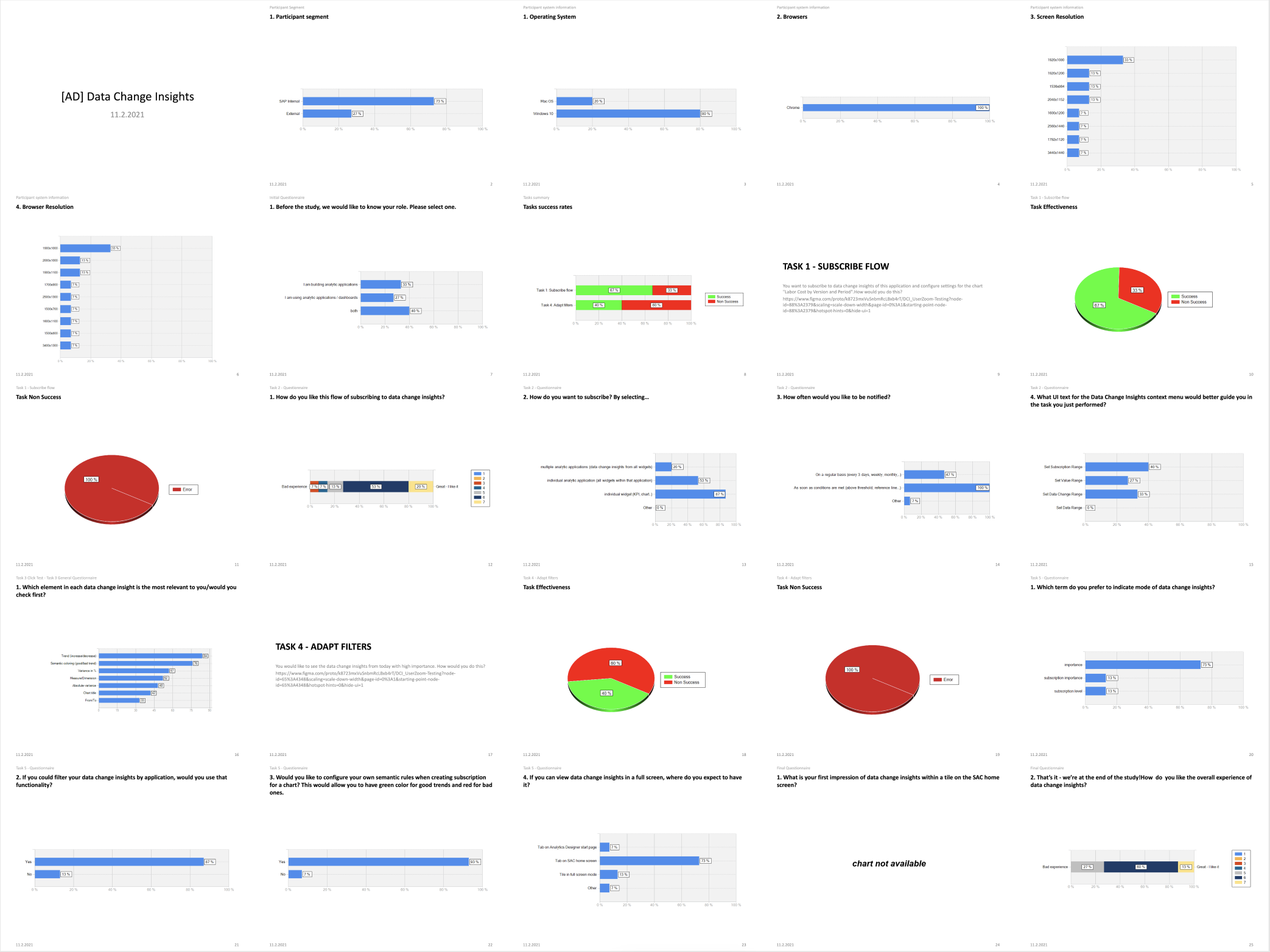
A Screenshot of UserZoom Testing Statistical Report
Key Feedback from Validation Session
Overall subscription flow and filtering capability are easy and intuitive
It would be nice to have a filtering dialog to reduce information density in a small drop-down menu
Customizable semantic coloring is what most users expect to have (out of scope)
How can I unsubscribe from my subscriptions? (the design concept has been delayed because of limited resources)
ITERATED DESIGN
Phase II - Filtering Enhancement
Aiming for a better user experience of viewing all filtered selections and clearer filter flows. Moreover, according to user habits, the design has convergence and iterated for less and more accurate data filtering mode.
We converged data filtering into a "multi-condition filtering" to meet the demands of a different number of conditions and different frequencies of the query. Multi-condition filtering refers to the mentality of matching results of a simultaneous query with multiple conditions at a time. It is suitable for service scenarios with multiple and complex conditions and slow real-time interface queries. In multi-criteria filtering, we put certain high-frequency conditions outside the panel to improve the exposure of the content (like Top N and Notification we exposed).
In Home Screen card of Data Change Insights, we plan to:
1) Move the filters in the drop-down menu currently to a filter dialog (which contains 3 tabs, each tab is designed for one filter)
2) When "OK" is clicked, will query for the latest data from the backend according to filter values
Trigger the query only when filters are changed.
3) Update the drop-down menu according to the new design
Iteration Summary
This enhancement not only improves the whole filtering experience showing all filter selections together but also queries for the latest data from the backend in a more efficient way
Reset to default capability gives a chance for different business users to reset default settings with one click (from a logical perspective, the system will persist last user behavior PER USER)
VALUE & INFLUENCE
This functionality expands the capabilities of data analysis in Analytics Designer applications and simplifies the way of tracking changes, both in the mode of convenient receipt of emails and in the mode of informational text messages in applications.
From the first quarter of 2022, it’s possible to use Data Change Insights as a tile on the home screen. Using this feature, a single visualization provides a summary containing information about significant data modifications that have occurred in several applications. The visualization is fully interactive, allowing users to search for a specific data change or filter changes according to various criteria (top N, time range, importance, and many others).
IDEATION & ITERATIONS GALLERY
Central Place Concept in a new tab - High-level picture (Abandoned considering UX Consistency)
Pinned and all data insights
(out of scope)
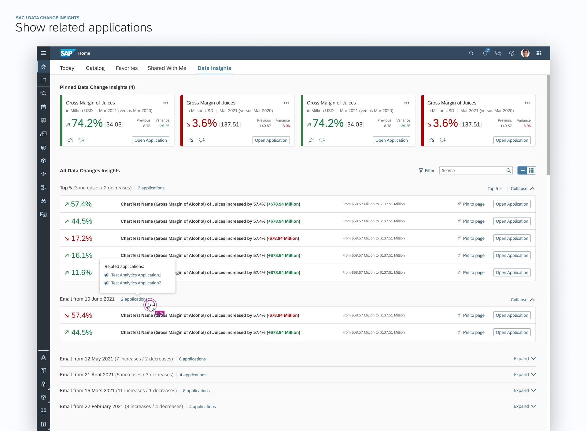
Hovered effect to show all related applications
(out of scope)
Responsive Spacing for Data Change Cards
Card Style & Homepage Explorations
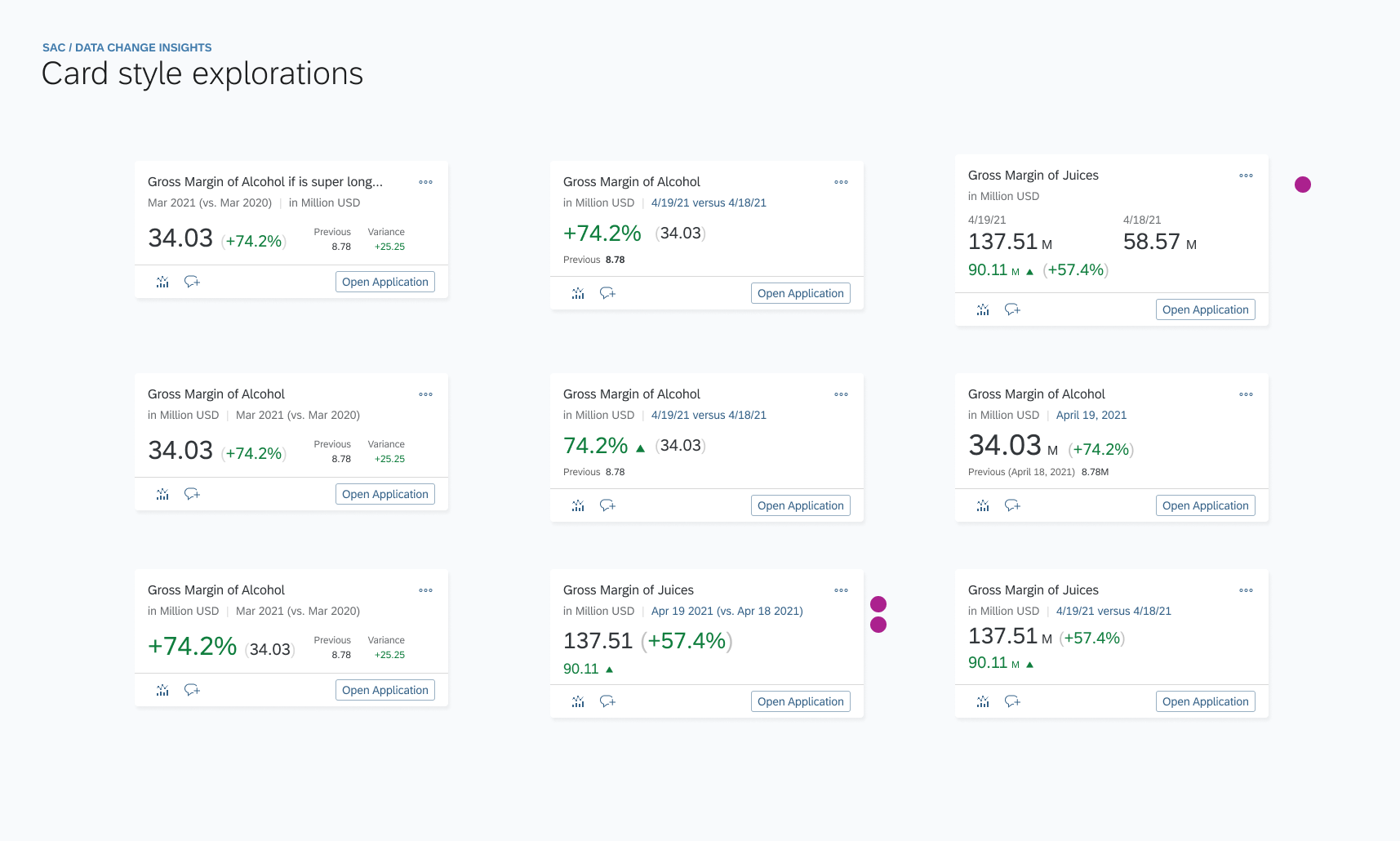
Out of scope because of time and resources
The text in tile only support limited HTML tags like <b>, <br>. Tags like <font>, <style> are both not supported…
Semantic Colors& Industry-specific Colors
Semantic colors denote standard value states (such as good, bad, or warning). Each color has the same basic meaning in all contexts.
Industry-specific colors reflect the color conventions in a line of business or industry. The meaning of each color depends on the business context.
In SAPUI5, industry-specific colors are called indication colors.
Considering the business case in different use cases - for example, in different business cases, increased data change may indicate good OR bad meaning behind it, so we CAN NOT simply use semantic colors to indicate industry-specific meanings.
In addition, in the future, we plan to enable users to configure and customized their semantic color customized based on their individual business cases to improve flexibility and better experience for users.
Explorations on semantic coloring and multi UI elements
(The text in tile only support limited HTML tags like <b>, <br>. Tags like <font>, <style> are both not supported…)
DESIGN SPECS
Sneak peek into design documentation (this feature will release in 2022 Q1):
CROSS-DEPARTMENTAL COLLABORATION FOR INNOVATION
This is another thing I contributed to this project.
Earlier this month, our SAP Analytics Cloud team, Innovation Center Network Team, and Globalization Services Team virtually teamed up for the 2022 ‘The Great Developer(DemoJam)’ Contest, leveraging respective field experiences and advantages to help target customers (like BWM Brillance) who’re interested in utilizing the social media integration service to improve their communication efficiency. We plan to invite some of them for further evaluation as well.
For customers, their key business users need to be notified immediately when some critical situation is changed. They need to quickly understand the current situation and take action with the necessary support.
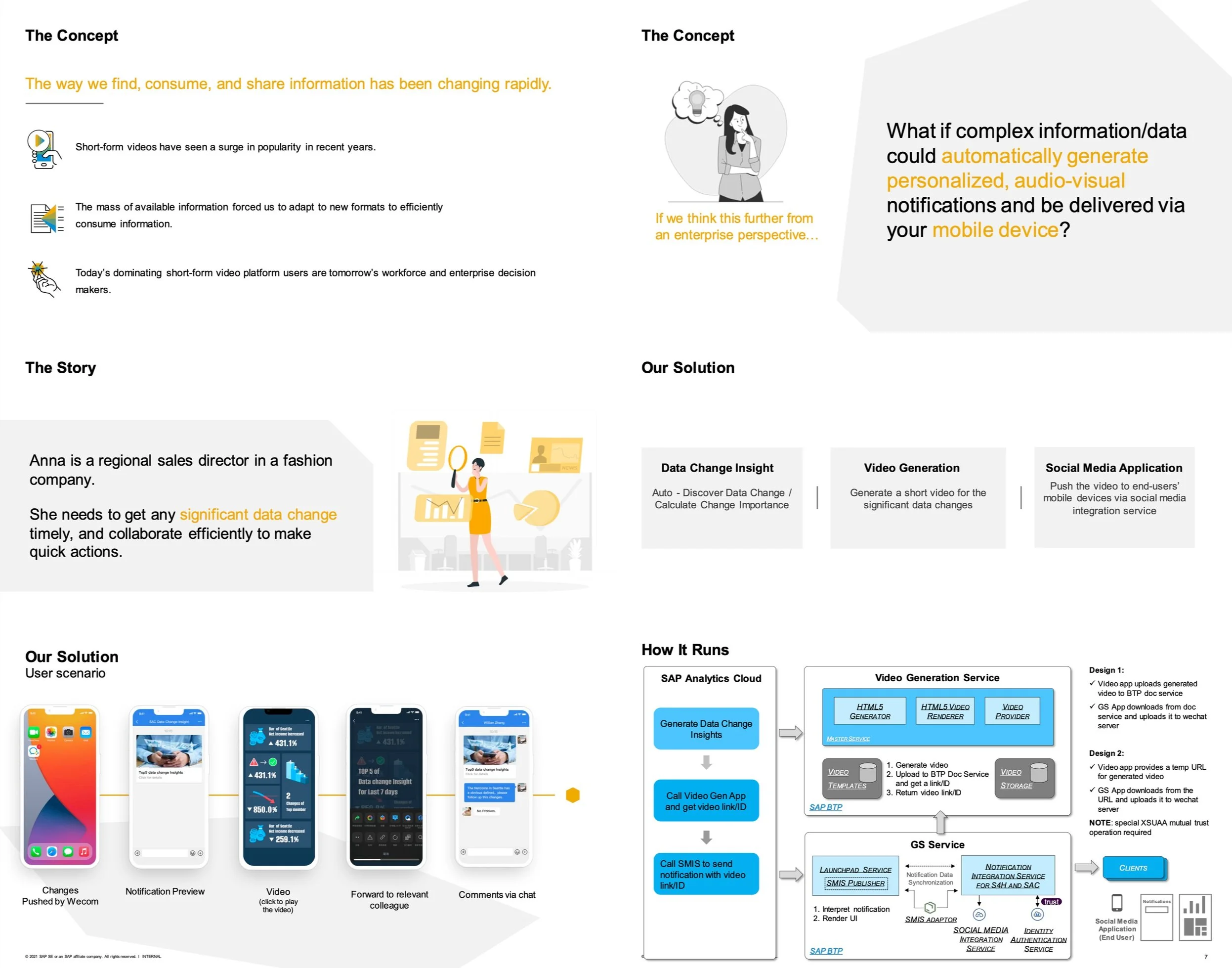
A Glance of Innovation Contest Pitch
Our Vision
Get important insights in seconds using audio-visual means every time and every where
Dealing with growing complexity in a fun and easy way
Animate data into storylines for additional insights
Flexible mobile collaboration via social media
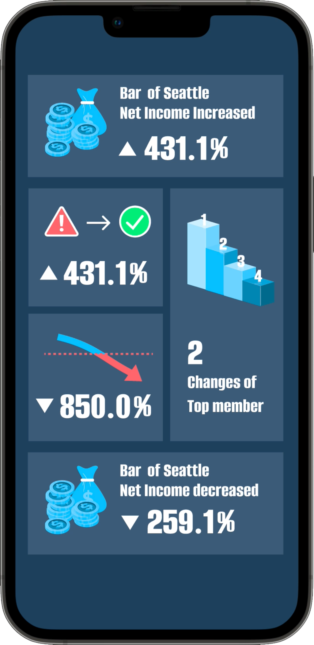
Personalized Visual Notifications
DCI -> Video -> Social Media App
(video generated by ICN team)
Consolidated Remarks from Judges
“This solution is very innovative to turn data insights into easy to understand short videos which is aligned with consumers usage behavior especially in China Market.”
“It is really a solid use case with strong user experience.”
“PoC mostly done and follow trends.”
TAKEAWAYS & REFLECTION
Strive for incremental small changes
No doubt that one responsibility of designers in a company is to think big. The blue sky view can help drive innovations. However, bringing up golden ideas and design is not enough. To realize the view, designers should be able to consider different limitations, phase out the design into incremental steps, and help to draw the line to the end goal.
Show the design early and often
Showing design at different fidelity levels and at different phases is very important. It helps the team to learn the progress and help the designers discover related efforts. Also, people from different positions give different perspectives and shed new light on the problem and the solution in the conversations.
Learn about users through various channels
One difficulty in designing enterprise products is the distance from the end-users. They can't be simply found on the street or in contacts. They could be very different from the designer. Therefore, to learn about them and build empathy, designers should tap into different resources. I talked to product owners, solution architect, and customer service people. They provided me with anecdotes and insights which inspired my design and supported my decision-making.
Reflection
This project faced several challenges and blocks, both from the senior design leader during the concept phase and the development team during the implementation process. Someone told me that - The best design is the best compromise, which I am still thinking of it. From prototype to product, desirability, feasibility and viability are three balanced topics we have to consider together during the whole process.
Home / DATA INSIGHTS ENABLER / USABILITY TESTING / LINKED ANALYSIS ASSISTANT / YIRENTAL / SKILL PAL / ORGANICOO / FOBO / SEEK / PLAY / ME